vueye-table
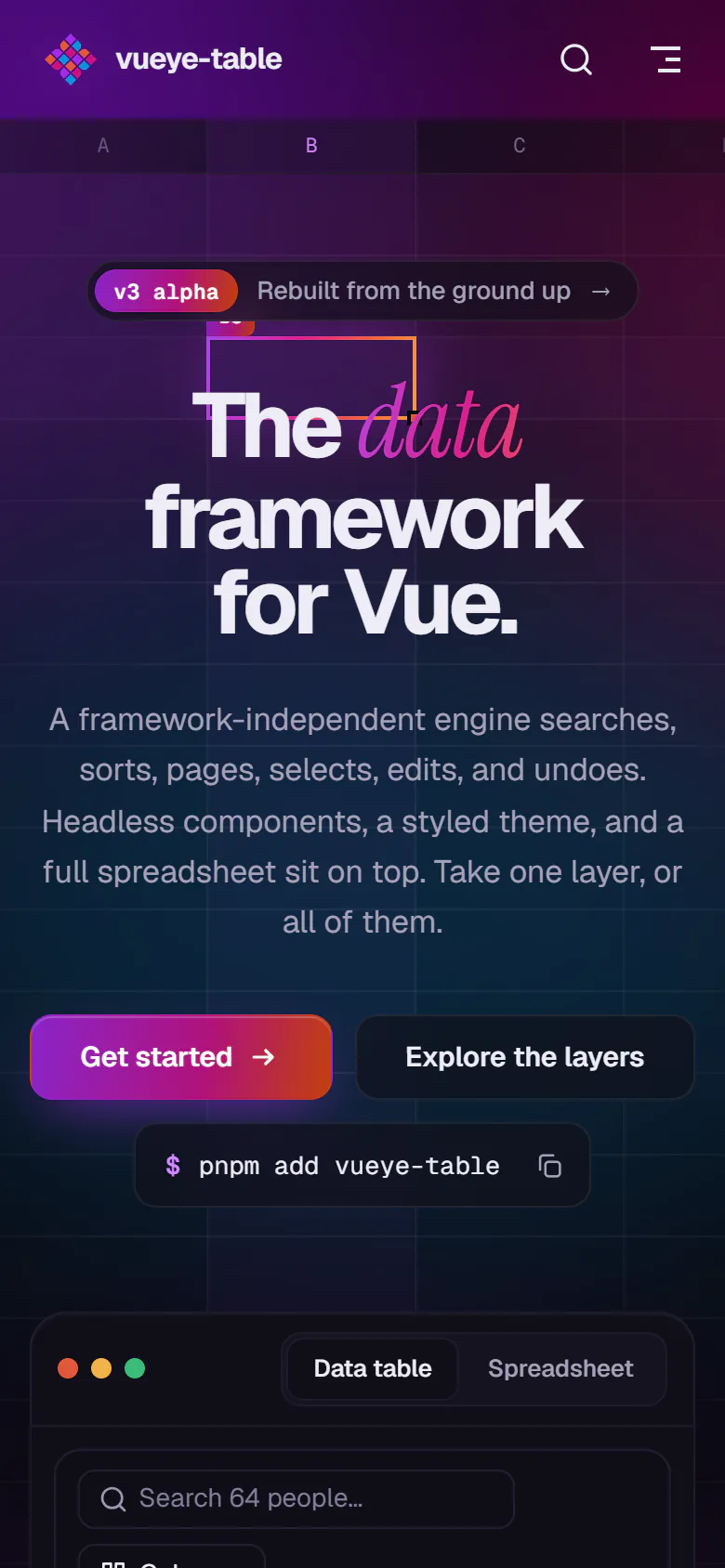
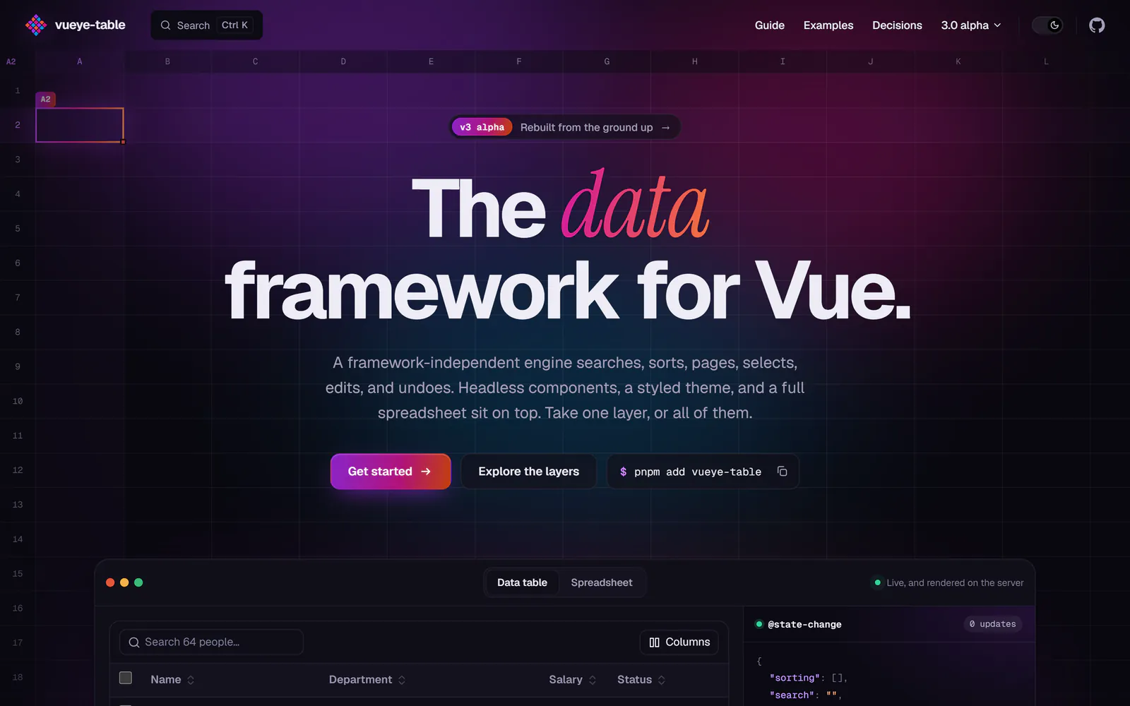
Data tables and spreadsheets for Vue.
A table library for Vue that separates data operations from rendering. A framework-independent engine handles search, filtering, sorting, pagination, selection, editing and undo. On top of it come Vue composables, headless components, styled components and a spreadsheet.
From one component to layers
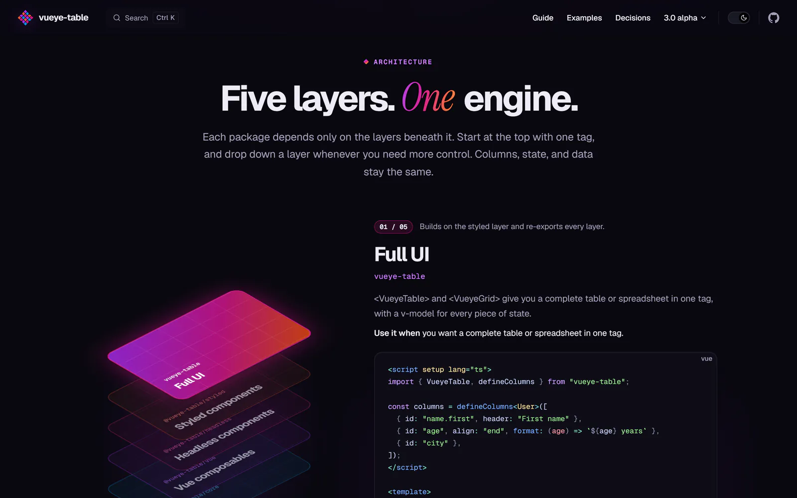
vueye-table began in 2018 as a single table component. Version 3 is a rewrite around one idea: a table is data plus state plus operations, and rendering is a separate concern. A framework-independent engine owns searching, filtering, sorting, pagination, selection, column visibility, editing, undo, clipboard and export. Vue layers sit on top of it, and you pick the one that fits.
| Layer | Package | Use it when |
|---|---|---|
| Full UI | vueye-table | You want a complete table or spreadsheet in one tag |
| Styled components | @vueye-table/styled | You want the look, arranged your own way |
| Headless components | @vueye-table/headless | You want accessible behaviour with your own markup |
| Vue composables | @vueye-table/vue | You want reactive state and nothing rendered |
| Engine | @vueye-table/core | You are outside Vue, on a server, or writing a binding |
| Nuxt module | @vueye-table/nuxt | You use Nuxt 4 |
Each layer depends only on the layers beneath it, and vueye-table re-exports all of them, so one install covers every level.
Typed columns
<script setup lang="ts">
import { defineColumns, type RowKey, VueyeTable } from 'vueye-table'
import { ref } from 'vue'

const columns = defineColumns<User>([
  { id: 'name.first', header: 'First name' },
  { id: 'name.last', header: 'Last name' },
  { id: 'age', align: 'end', format: age => `${age} years` },
  { id: 'city' },
])

const selected = ref<readonly RowKey[]>([])
</script>

<template>
  <VueyeTable v-model:selected="selected" :data="users" :columns="columns" selectable striped>
    <template #cell.city="{ value }">
      <strong>{{ value }}</strong>
    </template>
  </VueyeTable>
</template>
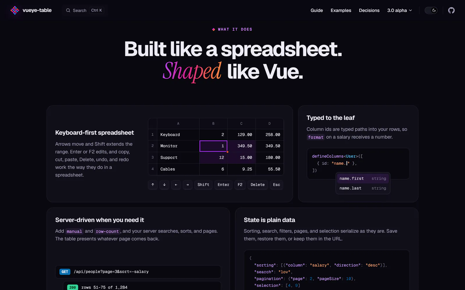
Column ids are typed paths into your rows, so format above receives a number. Every piece of state has a v-model: page, page size, sorting, search, filters, hidden columns and selection. Add manual and row-count and a server can search, sort and page while the table presents whatever page it returns.
The spreadsheet component
<VueyeGrid v-model:data="lines" :columns="columns" column-letters />
Cells edit in place. Arrows, Tab, Home and End move; Shift extends the range; Enter or typing starts an edit; Delete clears; and copy, cut, paste, undo and redo behave as they do in a spreadsheet application. Each edit emits a new array, and the one you passed in is never mutated. Text is parsed by the column's type, and a value that cannot be read is refused and reported through edit-error.
Using the engine without Vue
import { createTable } from '@vueye-table/core'

const table = createTable({ data: users, columns: [{ id: 'age' }, { id: 'city' }] })
table.search('lon')
table.toggleSort('age')
table.getSnapshot().rows // the current page
table.exportRows() // CSV of every filtered row
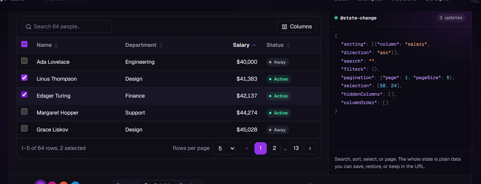
The state is plain serializable data, so it can be saved, restored, sent to a server, or kept in the URL.
Accessibility and styling
Headless components render semantic markup, with aria-sort, aria-selected, aria-rowindex, a polite live status and grid keyboard navigation, and expose their state through data-* attributes and slot props. The styled layer is driven by custom properties, follows prefers-color-scheme, and comes in compact, comfortable and spacious densities.
A closer look
One engine, two components
Screenshots of the data table and spreadsheet, which use the same engine.
Screens